227 posts

|
Post by ukpuppetboy on Jan 10, 2020 13:26:39 GMT
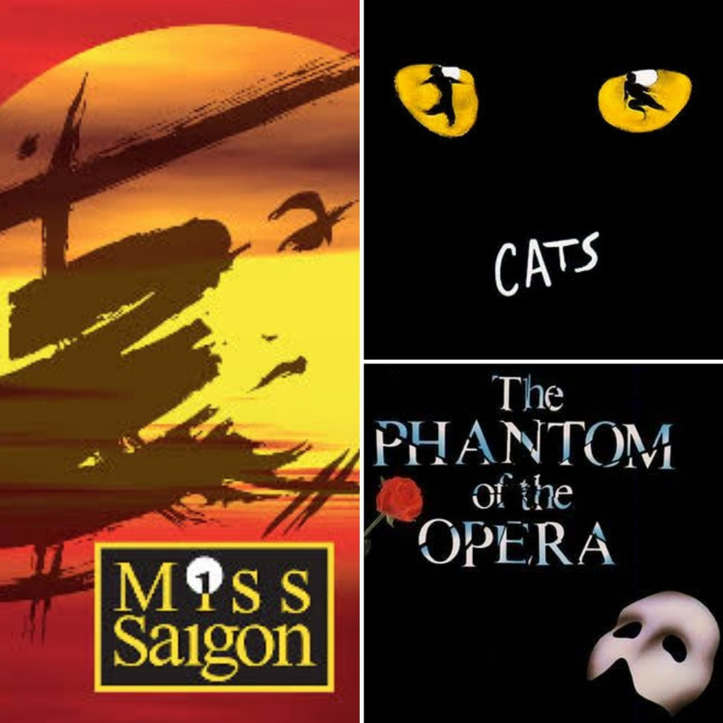
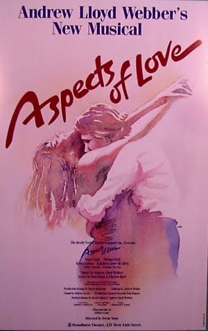
Given the reaction to the Cinderella show logo just released I was curious how this compares with other board members favourite (and least favourite) show logos and posters. Dewynters or otherwise. Much as I may dislike the show the Cats logo from 1981 is as iconic as ever and never bettered in any revision. Similarly the original Phantom poster from 1986 (which I feel gets diluted every time they attempt to modernise it). Conversely the Miss Saigon revival updated it’s logo beautifully & benefitted from the reworking in all the right ways.  And sometimes Dewynters’ logos can be just too contrived for their own good, and when Aspects on Broadway reissued their show poster as a waterclolour embrace I felt it was a much better fit for the show than the steganography face from London.  I could go on but I’m curious as to everyone else’s favourite/most striking/best suited or most hated designs... |
|
|
|
Post by crabtree on Jan 10, 2020 13:32:03 GMT
Oh I'm afraid I have always hated the Phantom logo, not just because the mask is wrong, but because it does not suggest the opulence and rich textures of the show. I rather loved the War Horse logo with the soldiers reflected in the horse's eye.
|
|
|
|
Post by Deleted on Jan 10, 2020 13:33:41 GMT
Going to surprise literally nobody, but I adored the mega musical logos.
Cats/Starlight Express/Les Mis/Phantom/Aspects of Love/Miss Saigon/Sunset Boulevard.
These were total package musicals for me though where everything worked!
|
|
|
|
Post by WEGuy93 on Jan 10, 2020 13:36:13 GMT
The updated Miss Saigon main creative and the Daniel Radcliffe Equus are firm favourites for me - Both Dewynters
|
|
7,059 posts

|
Post by Jon on Jan 10, 2020 13:48:05 GMT
The 1993 Grease logo is one I’ve always liked along with the original logo for Mary Poppins which Disney replaced a few years later.
|
|
19,670 posts

|
Post by BurlyBeaR on Jan 10, 2020 15:14:24 GMT
Cats : hate the show, love the logo.
Les Mis is pretty iconic.
Wicked, with the green and white witches whispering is very good.
|
|
|
|
Post by Deleted on Jan 10, 2020 16:13:52 GMT
The years when the Miz logo was adapted for all sorts of reasons was wonderful. For me, "Cats" remains the design classic, though. Cosette in a viking helmet was one of my favourites. |
|
|
|
Post by theatre241 on Jan 10, 2020 16:25:22 GMT
The Cinderella logo looks like it’s been made on Microsoft in 2010 lol but I loved company’s revival logo and overall branding. Almost forgot about the beautiful logo for Follies at the National
|
|
|
|
Post by Deleted on Jan 10, 2020 16:41:05 GMT
I stopped following the Cinderella thread but had to go and have a look to see what the fuss was about.
Wow. Yes. I don't know quite what was going on there, but I imagine that somewhere in the design process the phrases "They want how much?" and "How hard can it be?" were featured.
|
|
|
|
Post by Deleted on Jan 10, 2020 17:03:28 GMT
The Miss Saigon revival poster is one my favourites, without question. Equally the Finding Neverland poster is gorgeous too. Personally I’m also a huge fan of Disney’s theatrical posters, especially those that are themed with a flat stylised image of an icon from the show (lion face, snowflake, Tarzan on a vine etc.) They really feel as though they are part of a series. On the same note, the image used on Broadway for Frozen is stunning with the “hidden” Elsas. Another favourite of mine was the poster used for the Light Princess at the National, now that was stunning.
Worst: Chicago, Avenue Q (Selladoor production), The Girls (the typeface was basic, though the sunflower image was ingenious).
|
|
4,961 posts

|
Post by Someone in a tree on Jan 10, 2020 18:07:51 GMT
One of my all time favourites from Opera North 1996.  |
|
4,961 posts

|
Post by Someone in a tree on Jan 10, 2020 18:12:04 GMT
And another Weill again from Opera North .  |
|
4,961 posts

|
Post by Someone in a tree on Jan 10, 2020 18:13:43 GMT
Out of the biggies Cats is very amazing but Sweeney has got to my fave. Great show and a classic logo to boot  |
|
|
|
Post by Seriously on Jan 10, 2020 18:40:01 GMT
As long as it's not one of those dreadful "Let's just have the name of the show in dressing room mirror lights, with some clip art" ones.
|
|
1,481 posts

|
Post by steve10086 on Jan 10, 2020 18:53:20 GMT
 I’d add Joseph to the iconic Dewynters logos |
|
8,103 posts

|
Post by alece10 on Jan 10, 2020 19:08:37 GMT
I don't know how to add a picture but A Chorus Line us quite iconic.
|
|
879 posts

|
Post by daisy24601 on Jan 10, 2020 19:31:40 GMT
I do like Wicked, I have it as my phone cover even though it's not one of y top musicals. It's more interesting than some.
I also like Marguerite, quite fitting of the era.
|
|
7,059 posts

|
Post by Jon on Jan 10, 2020 20:30:20 GMT
The NT Oklahoma! logo was simple but very effective as was the 2001 My Fair Lady although can anyone confirm if there is a hidden image in the latter as it does look like someone dancing in the hat?
|
|
128 posts

|
Post by emeraldbaudelaire on Jan 10, 2020 21:36:31 GMT
Worst has to be the Carrie logo for me. Its supposed to be her face but it's more like hieroglyphics.
|
|
|
|
Post by nick on Jan 11, 2020 19:11:13 GMT
|
|
|
|
Post by nick on Jan 11, 2020 19:19:23 GMT
|
|
|
|
Post by originalconceptlive on Jan 12, 2020 2:33:54 GMT
I do not like the Dewynters design for the UK premiere of Once On This Island back in 1994. It 'makes sense' in a literal kind of way for the show, but out of context, it's strange. Especially the cropped version on the front cover of the album, which makes the show look as though it's going to be about a dinosaur or something. (It's actually meant to be a tree with an eye.) :format(jpeg):mode_rgb():quality(90)/discogs-images/R-2999276-1311114420.jpeg.jpg) On a more positive note, I think the below 'Carnival' art from the 2007 Kennedy Center production conveys the creepy aspect of the show better than some.  |
|
227 posts

|
Post by ukpuppetboy on Jan 12, 2020 9:38:08 GMT
I would have to think long and hard to come up with a less inspiring logo than the revival of “She Loves Me” that was at the Savoy with Ruthie Henshall & John Gordon Sinclair. Such a beautiful show with such a stellar cast. I’m sure the am-dram poster actively put people off..  I’ll add to the list of fails almost every show at the NT in Nick Hytner’s tenure when the marketing department went through their phase of using the title of the play for the poster - but at a jaunty angle. Always the same font. Always a plain background. No graphics. Bland bland bland. And seemed to go on for years... |
|
751 posts

|
Post by horton on Jan 12, 2020 9:52:33 GMT
ukpuppetboy absolutely agree!
I've always yearned for some beautiful Hungarian artwork to conjure the romance of She Loves Me but alas the picture above evokes nothing- although it was "by far the best musical in town"
|
|
227 posts

|
Post by ukpuppetboy on Jan 12, 2020 10:03:20 GMT
although it was "by far the best musical in town" It REALLY was. And deserved a run 5 times longer than it received. That cast ran rings around the revival at the Menier. |
|